Data Dashboards
Data Dashboards provide a visual perspective over large volumes of FHIR data without any special ETL tools, expensive database, and reporting infrastructure. When you visualize thousands of related items at once, you can see trends and patterns that would otherwise not be apparent when you look at one item at a time. The Visualizer dashboards display full, high-resolution, highly customizable graphical charts with short load times, while the animations and natural transitions provide context and prevent you from being overwhelmed by large quantities of information. As an analyst, there are several business reasons to visualize your data in this way. For example, you can analyze data to detect abnormal activity with claim amounts. To do this, you can gather all the claims made on a particular day or coming in from a certain provider to confirm the claim amounts are legitimate. You can also analyze patients' observations, hospital visits over a month or more to determine a pattern, if one exists.
XES Module for FHIR uses Edifecs Visualizer Server to aggregate data and highlight the required information in the form of dashboards. Visualizer Server uses Kibana that is an open source analytics and search dashboard that functions using Elasticsearch. With Data Dashboards, you can combine multiple visualizations on a single page and filter them using your custom criteria. For more information, see Visualizer Server documentation.
To visualize FHIR data through the XES Module for FHIR web portal, you must first install SpecBuilder including Visualizer Server.
 To configure data visualization To configure data visualization
- Install SpecBuilder including Visualizer Server. For more information, see Install SpecBuilder with Visualizer Server in SpecBuilder Help Center.
- Go to the ${XESFHIRRoot}/assets/VisualizerPackages folder and import the .zip archives to Visualizer Server to add a data store and a dashboard.
- First, in Visualizer Server, on the TEMPLATES page, click IMPORT NEW.
- In the Import new Package dialog, click Choose File.
- Navigate to the package archives at: ${XESFHIRRoot}/assets/VisualizerPackages, and then select fhir-patients.zip.
- Click Perform after import actions.
- Select Create Data Stores and Create Dashboards, and then click IMPORT. The packages are imported and available in the template list.
- From the ${XESFHIRRoot}/assets/ProfileImages location, deploy the XEServer(9.1.0)_FHIR Bridge Dashboards.zip profile to Edifecs Application Manager. For more information, see the To deploy a full image from the file system procedure in the Deploy an Image topic in Edifecs Application Manager Help Center.
- Go to the XES Module for FHIR web portal, in Settings, on the Visualizer tab, and then enable Visualizer.
- In Visualizer Dashboard Name, enter the name of the dashboard you just imported to Visualizer Server. For example, FHIR-Patients.
- In Visualizer Data Store Name, enter the name of the data store you just imported to Visualizer Server. For example, fhir-patients.
- In Visualizer Access Token Path, enter a path to the folder with security tokens. A token archive is generated during the installation of Visualizer Server. The directory with default security tokens is specified during the installation process. By default, this directory location is: C:\Users\<YourUsername>\Documents\Edifecs\VisualizerServer\tokens.
- In Edifecs Application Manager, open the XEServer(9.1.0)_FHIR Bridge Dashboards profile.
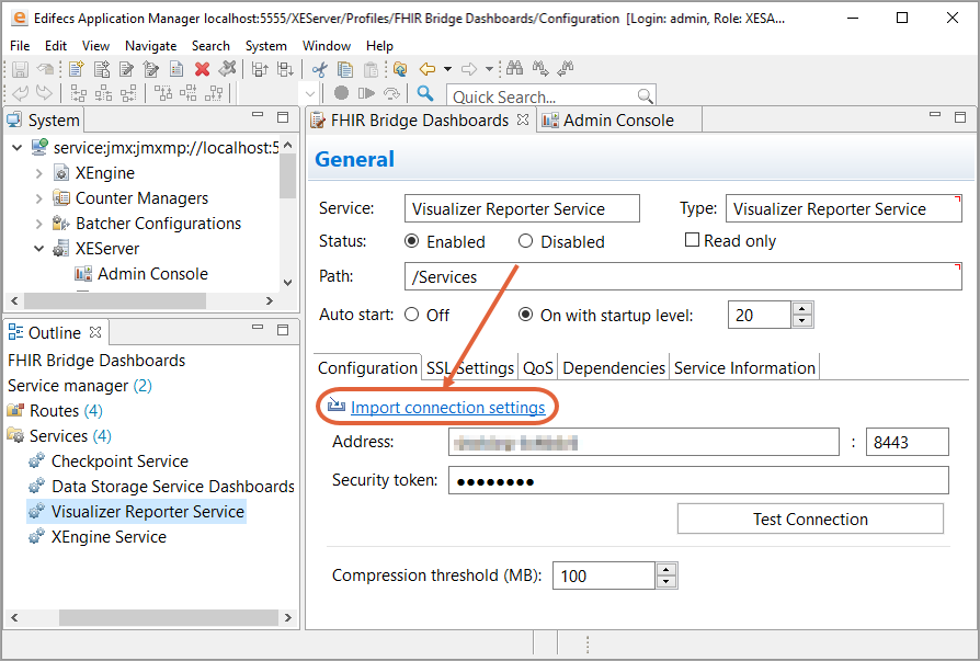
- On the Outline tab, go to Service manager, in Services, and then to Visualizer Reporter Service.
- On the Configuration tab, click Import connection settings and then navigate to Visualizer Server tokens. For more information, see Generate Security Token.
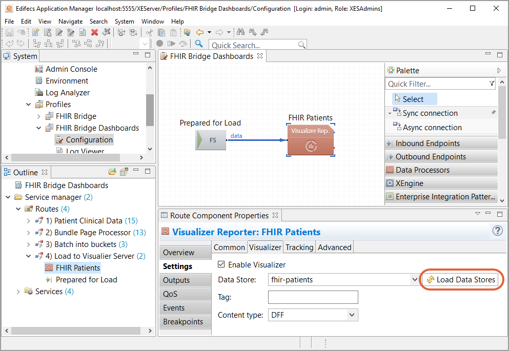
- In the Load to Visualizer Server route, go to the FHIR Patients component.
- In Settings, on the Visualizer tab, click Load Data Stores.
- From the drop-down list, select the data store you just imported to Visualizer Server. For example, fhir-patients.
- Save your settings, and then run the profile.
- On the XES Module for FHIR web portal, in the Visualizer section, click Load FHIR Data.
The XEServer profile “visualizes”/reads and displays FHIR data. When you click Load FHIR Data on the Visualizer page of the XES Module for FHIR web portal, the XEServer profile does the following:
- Receives a trigger that gathers Patient IDs of all the patients using the REST client.
- Using the corresponding Patient ID, gathers information about each patient and all the related observations that have one of the following LOINC codes: 13457-7 and 4548-4 and creates a bundle that is then mapped to the DFF file.
- Uploads the DFF file to Visualizer Server using the Visualizer Reporter component.
The following information is available on the Visualizer dashboard on the Visualizer page of the XES Module for FHIR web portal:
- The total number of patients.
- A bar chart that displays the age distribution of patients.
- A bar chart that displays the top 15 states of patients' residences.
- A bar chart that displays the top 15 postal codes of patients' residences.
- A pie and bar chart that displays the patients' cholesterol levels (the percentage and quantity ratio).
- A pie and bar chart that displays the patients' hemoglobin levels (the percentage and quantity ratio).
To remove the data from the XES Module for FHIR web portal, click Purge Data Store.
|
|